Data Visualisation: Confirmed New Zealand COVID-19 Cases
The objective is to provide insights based on the information from the New Zealand (NZ) Ministry of Health. Here is the link for obtaining the COVID-19 cases. Will look at the exploring the confirmed cases per District Health Board - commonly known as DHB, gender and age group.
With time I might automate the data visualisation - the tricky bit is that the table format and HTML texts/labels keep changing every time. This caused errors in my previous automated visualisation making it difficult to automate data extraction/mining.
Data Mining and Cleaning
I used rvest and xml2 packages for data mining, tidyverse for data exploration and visualization. The codes can be viewed here.
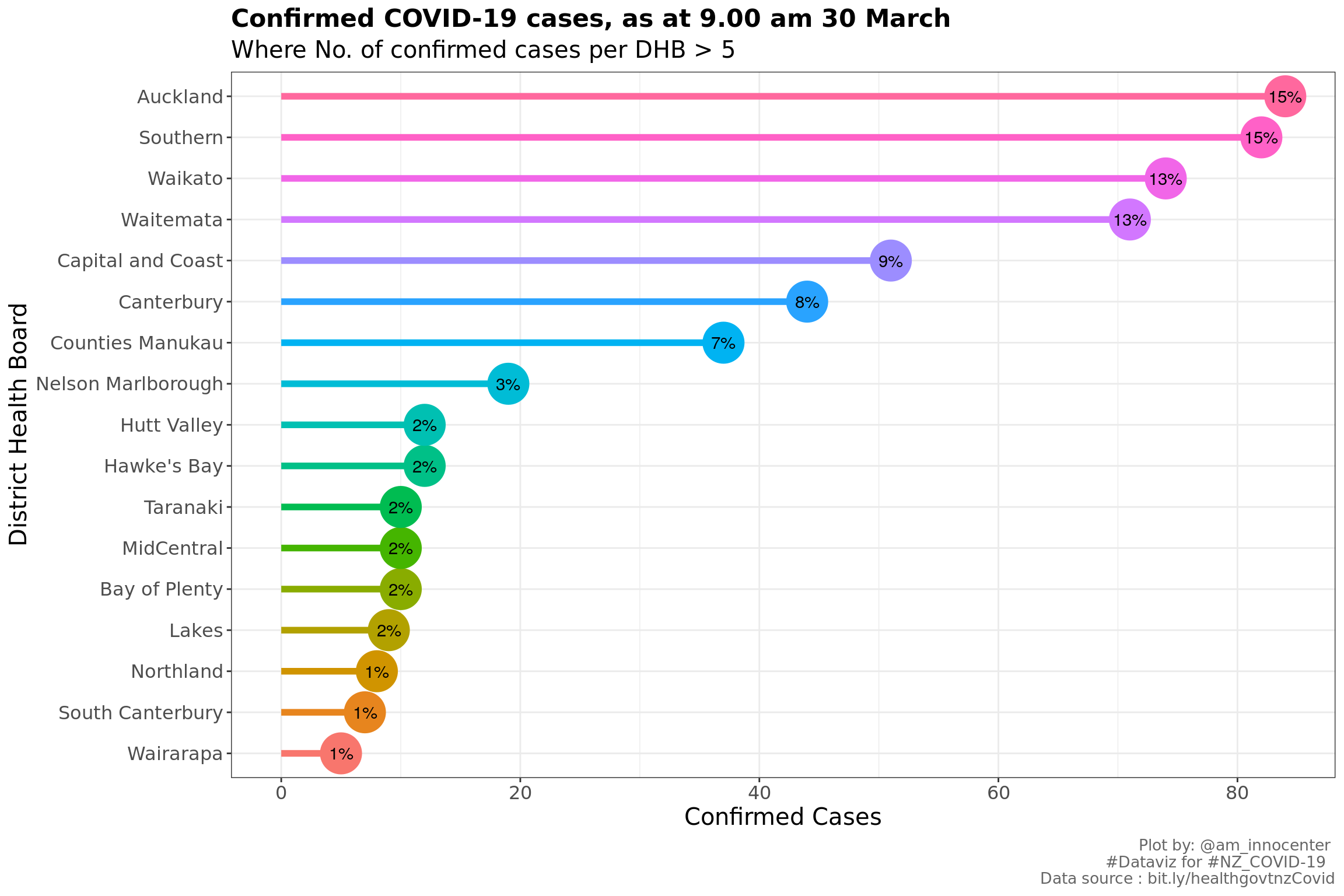
We have 552 confirmed cases as at 9.00 am 30 March. Below is a glimpse of the confirmed cases - the table only has variables of interest
## Observations: 552
## Variables: 6
## $ `Report Date`            <date> 2020-03-29, 2020-03-29, 2020-03-29, 2020-03…
## $ Sex                      <chr> "Male", "Female", "Male", "", "Female", "Mal…
## $ `Age Group`              <chr> "50 to 59", "50 to 59", "40 to 49", "20 to 2…
## $ DHB                      <chr> "Auckland", "Auckland", "Auckland", "Aucklan…
## $ Overseas                 <chr> "Yes", "Yes", "", "", "", "Yes", "No", "", "…
## $ `Last country before NZ` <chr> "", "", "", "", "", "", "", "", "", "United …
Data Visualization
From the above chart, we observe that Auckland, Southern, Waikato and Waitemata are the top four DHBs which constitutes 41.12 % of the total confirmed COVID-19 cases in NZ.
When analysing individual variables, I noticed some missing information on gender, age group were missing. We shall exclude these
#summary 1 by age and gender
confirmed.cases.by <- confirmed.cases %>%
  group_by(`Age Group`, Sex) %>%
  count(`Age Group`) %>% #count cases per DHB
  arrange(`Age Group`) %>%
  mutate( prop=n*100/tot) %>%
  filter(! `Age Group`== "" & !Sex =="")
Removing them reduced the data set by about 1 percent
#visualization 1
confirmed.cases.by %>%
  mutate(count= if_else(Sex=="Female", -n, n)) %>%
ggplot(mapping= aes(`Age Group`, count, fill=Sex, label=paste0(round(prop,1), "%")))  +
  geom_bar(stat = "identity")+
  coord_flip()+
  scale_y_continuous(breaks = seq(-60, 60, 20),
                     labels = c(seq(60,0,-20), seq(20,60,20)))+
  labs(x="Age group", y="Confirmed Cases", title ="Confirmed cases per Age group and gender" ,subtitle = tail(str_split(caption[1], ",")[[1]],1), caption = "Plot by: @am_innocenter \n #Dataviz for #NZ_COVID-19  \n Data source : bit.ly/healthgovtnzCovid")+
  theme(text = element_text(family = "Comic Sans MS", size = 14),
        plot.caption = element_text( size=10, color = "gray40"),
        plot.title =element_text(size = 16, face="bold", vjust=1) ) +
  geom_text(show.legend = F, color="black", size=4.5)+
  geom_text(aes(3,-45), label="\u2640", hjust = 0.5, size = 25,color = "#F8766D", family = "Comic Sans MS") +
geom_text(aes(3,30), label="\u2642", hjust = 0.5, size = 25, color = "#00BFC4", family = "Comic Sans MS") 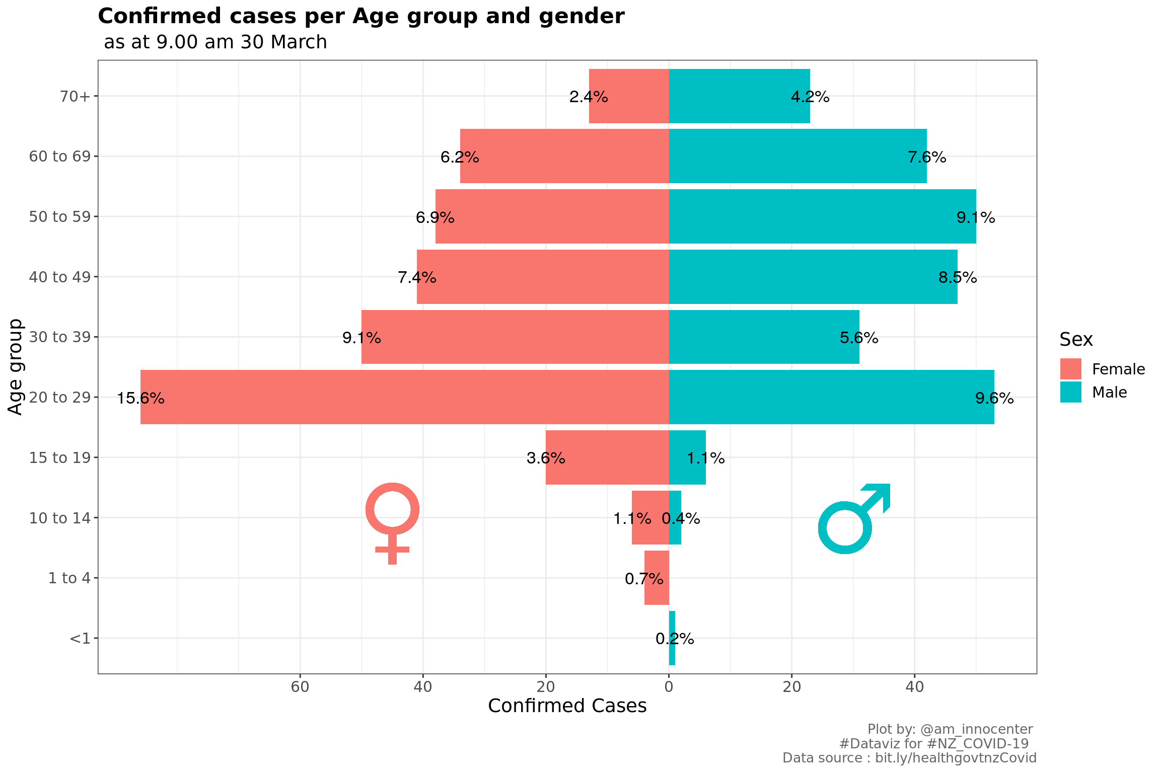
The age group with the highest confirmed cases is 20 to 29 which is 25.54% of the total confirmed cases, followed by 40 to 49 with 16.12 % and then 50 to 59 with 16.12%. We have more female confirmed cases.
#visualization
confirmed.cases %>%
  filter(! `Age Group`== "" & !Sex =="") %>%
  group_by(`Report Date`, `Age Group` , Sex) %>%
  count(`Age Group`) %>%
  ggplot(mapping=aes(`Report Date`, `Age Group`, size=n , color=Sex)) +
    geom_point() +
    scale_x_date(date_breaks =  "2 days" , date_labels = "%d %b")+
    theme_light()+
    labs(x="", y="Age Group",title = "Confirmed cases trend per Age group and gender" ,subtitle = tail(str_split(caption[1], ",")[[1]],1),
         caption = "Plot by: @am_innocenter \n #Dataviz for #NZ_COVID-19  \n Data source : bit.ly/healthgovtnzCovid")+
    theme(text = element_text(family = "Comic Sans MS", size = 14),
          plot.caption = element_text( size=10, color = "grey40"),
          plot.title =element_text(size = 16, face="bold", vjust=1) )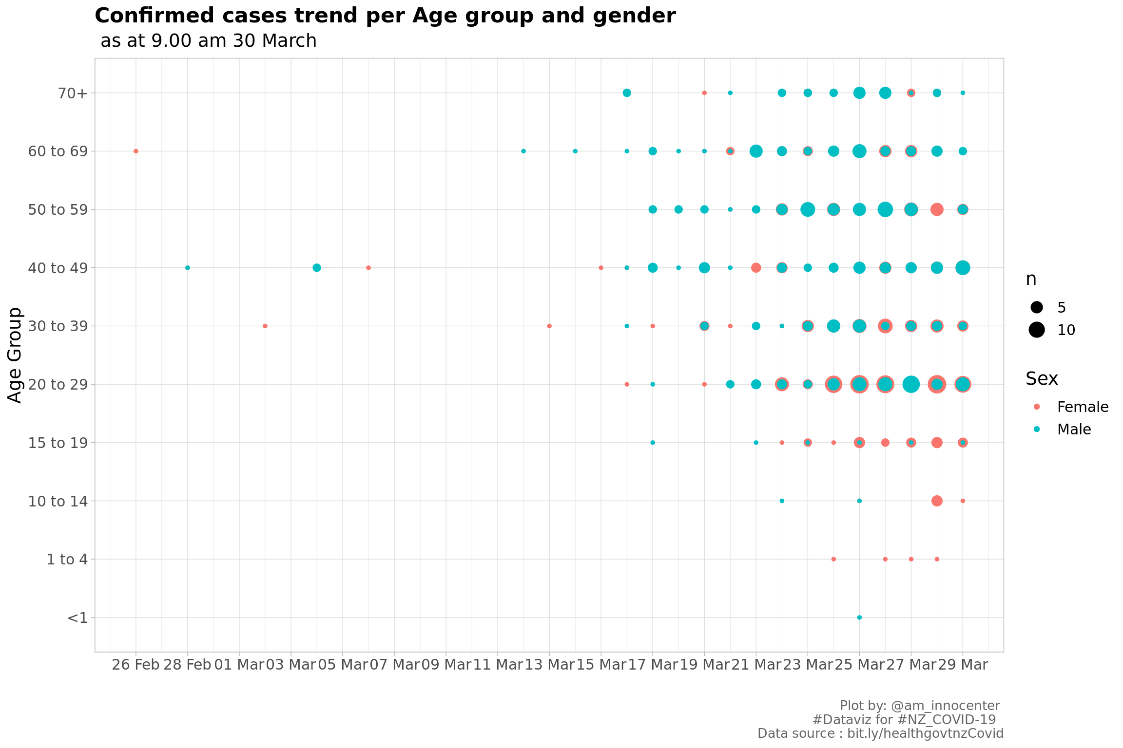
Almost a similar chart as above, this however includes time. The size of the doot indicates the number od confirmed cases recorded. Initially the confirmed cases were from people > 30 years and over time the cases were recorded for people < 20 years including one <1 year and four who are in the 1-4 age group.
Creating a wordcloud of the Last country before New Zealand. Some of the confirmed cases have New Zealand as the last country to imply within-country travel and this is based on the flight Nos. Hover to get the count for each country.
#renaming UK, USA and UAE - they take so much space in the wordcloud
confirmed.cases <- confirmed.cases %>%
  mutate(LastCountry =
           case_when(`Last country before NZ` == "United States of America" ~ "USA",
                    `Last country before NZ` == "United Kingdom" ~ "UK",
                    `Last country before NZ` == "United Arab Emirates" ~ "UAE",
                     TRUE ~ `Last country before NZ`))

#remove spaces for other countries
confirmed.cases$LastCountry <- gsub(" ", "", confirmed.cases$LastCountry)

#creating word corpus
country.corpus <- Corpus(VectorSource(confirmed.cases$LastCountry))
country.corpus <-  TermDocumentMatrix(country.corpus)

#creating dataframe
m <- as.matrix(country.corpus)
v <- sort(rowSums(m),decreasing=TRUE)
LastCountry.df <- data.frame(word = names(v),freq=v)

#wordcloud
wordcloud2(LastCountry.df,size=1.6,color='random-dark',  fontFamily="Comic Sans MS")
The top five last country of before NZ from the word cloud above and frequent table below:
- USA | 72
- Australia| 42
- UAE | 31
- Singapore | 15
- Qatar |14